
Role: Creative Lead and Art Direction
Collaborators: George Gordon - Sr. Communication Specialist
Maria Brennan - Wellness Coordinator
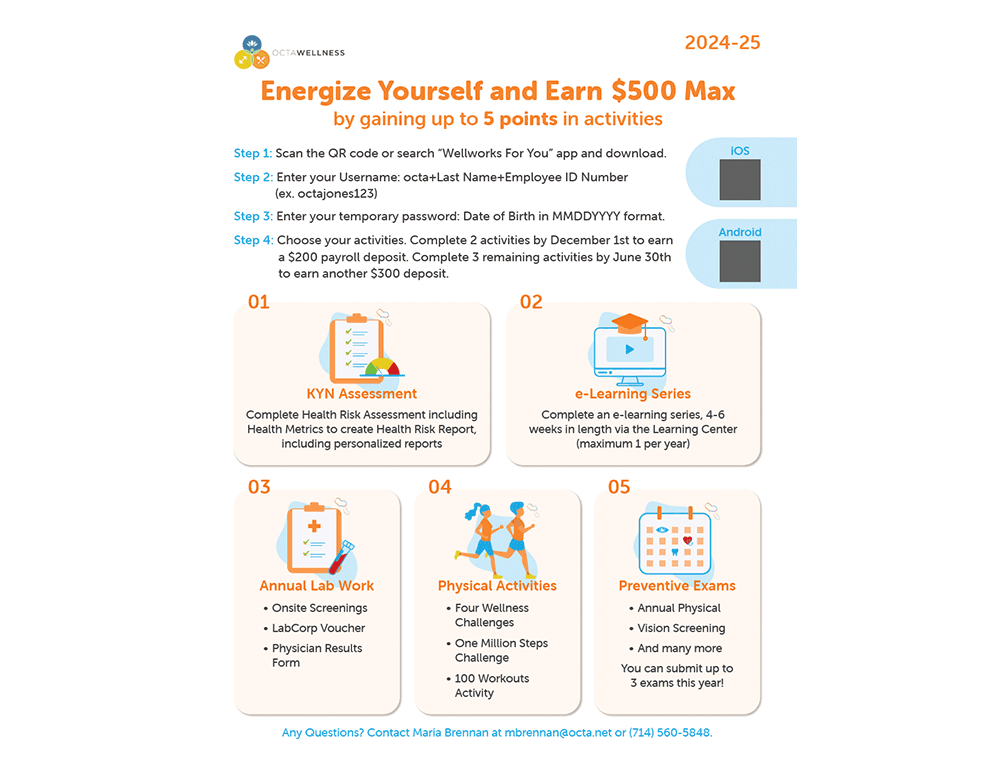
Objective: To revamp the employee wellness program communications for the 2024-25 fiscal year and visually highlight the new updates
Materials: Created printed flyers, poster, digital signage, carousel image for the intranet and e-blast graphic with new visual concept and style guide
Outcome: Boosted program participation by 5% compared to the previous year
Tools used: Adobe Illustrator
OCTA WEllness campaign
Primary
Hex #f27721
Orange is one of the colors OCTA has frequently used in its marketing materials. This bright shade of orange is selected to reflect the theme of “Energize” for the new Wellness campaign.
Secondary
Hex #28abe2
The light blue color is well-connected with OCTA brand and it is used here to complement the primary color, orange.
Accent
OCTA logo and official brand color

This typeface is selected as the primary because of its thickness in bold font reflects the theme of “Energize.”

This secondary typeface is selected because of its legibility and similar character to the primary typeface.


PROCESS

Pen sketches
Flyer layouts first draft

Poster first drafts

Activity Category Illustrations


